
Authored by Mugdha Raut
A lamp is never just a lamp. As Caroline Winkler suggests, think of it as the jewelry of a room: small in footprint, enormous in impact. And yet most people buy lamps the same way they buy a phone charger — functional, forgettable, replaced eventually. The result? Bases that fight their tables, shades that make a whole room look jaundiced, proportions that belong in a different house entirely.
It does not have to be that way. Choosing the right lamp is one of the easiest wins in interior styling — once you know what to look for. Consider this your cheat sheet.
Start With Placement — Not Style
The single biggest mistake in lamp shopping is leading with aesthetics. Before you consider color, shape, or material, you need to answer one question: where is this lamp going, and what does it need to do there?
A bedside lamp has a very different job from a desk lamp or a living room floor lamp. A reading lamp demands focused, downward light. An ambient lamp in a living room corner should cast a warm, diffused glow. A task lamp at a workspace needs adjustability and brightness.
Defining function first narrows your choices immediately and protects you from a beautiful lamp that simply doesn't work in its intended spot.
This floor lamp throws diffused light downward to occupants of the couch and negates the need for an additional ceiling light. It's enough to meet both the ambience and functional lighting needs of this corner.
Photo by John Black on Unsplash
Dimensions: The Rule Most People Ignore
Scale is everything in interior design, and lamps are no exception. A lamp that is too tall or too short for its surface does not just look wrong — it performs poorly.
For table lamps, the combined height of the lamp and the surface it sits on should ideally fall between 58 and 64 inches from the floor. This places the light source at a comfortable height whether you are seated on a sofa or lying in bed. If you are buying a lamp for a side table you sit next to such as a sofa end table or a bedside table, the bottom of the shade should be roughly at eye level when you are seated. This prevents glare while ensuring the light reaches where you need it.
As a general rule: taller surfaces call for shorter lamps, and lower surfaces can carry a taller silhouette. A lamp placed on a console table against a wall, for instance, can afford to be more dramatic in height since no one will be seated directly beside it.
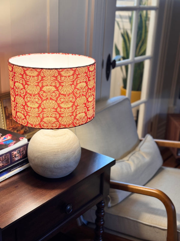
This table lamp, a fun play on marigold, is at the right height to meet the eye level of a person sitting on the sofa. It serves as both a statement piece and an aptly proportioned lamp vis-a-vis the couch and the surface it's sitting on.

Pairing the Base to Its Surface: The Materiality Spectrum
Here is a design truth that does not get said enough: matching your lamp base to your table is almost always the wrong move. A teak lamp on a teak side table does not look cohesive — it looks like you ran out of ideas. What actually creates depth, character, and that elusive quality of a space feeling designed is tension — and tension comes from contrast. This is not a stylistic preference. It is how materiality works.
“Think of every material in your home as sitting somewhere on a spectrum” says Noah Daniel. At the softer, natural end: raw wood, unglazed ceramics, linen. Moving along: stone, textured concrete. At the far end: things that feel more man-made and sharp: glass, lacquer, glossy tiles, and at the farthest end, metal. The further apart two materials sit on this spectrum, the more interesting energy they generate together — that tension is where styling depth lives. This is precisely why a ceramic or marble lamp base on a warm wooden side table feels so visually alive. One material is organic and grounded, the other cool and precise, and the contrast between them is what gives the pairing its pull. This principle does not stop at table lamps. It applies to every lighting decision and every decorative object in a room — A matte ceramic pendant over a polished marble kitchen island. A concrete sculpture beside a linen sofa. In each case, the contrast between materials is doing the decorating for you.
Finish matters here just as much as material category. A brushed matte brass fitting on a high-gloss marble surface creates contrast — same tonal family, opposite finish energy. A polished gold fitting on that same surface collapses into noise because both are sitting at the same harsh, reflective end of the spectrum with nothing to push against.
The goal is never to match. It is to create a conversation between materials and the more distinct the two voices, the more considered the room feels.
Glass lamp base placed on a wooden side table portrays the tension and contrast in materials.
Photo by Miah Dailey on Unsplash
Base Shape and Material: Anchoring Your Design Theme
Once you know the surface, look at the room. The shape and material of the lamp base should reflect or intentionally counterpoint the design theme of the space.
For example, in minimalist or Japandi interiors, reach for simple cylindrical or spherical-form bases in matte finishes: unglazed ceramics, concrete, or pale stone. In maximalist or eclectic spaces, sculptural forms like asymmetric, hand-modeled, or architecturally bold bring personality without chaos. Traditional or classic interiors tend to suit turned wood, antiqued brass, or table lamps with a more symmetrical, column-like silhouette. Contemporary spaces offer the most freedom: geometric metal bases, blown glass, and layered mixed materials all feel at home.
Material also affects the perceived weight of the lamp. A solid brass base reads as grounded and permanent. A glass base feels airy and light-filled. Choose based on what the room needs — ballast or levity.
Choosing the Right Lampshade: Color, Pattern, and Form
The shade is where most of the room's light actually gets filtered and its color, pattern, and shape have a disproportionate effect on the entire mood of a space. White and off-white read clean and versatile. Ivory and cream cast a warmer, amber-toned glow — better suited to bedrooms and living areas. Darker shades like charcoal, forest green, terracotta add drama but absorb light
Then there is the option most people overlook entirely: the printed lampshade. If a plain shade is a whisper, a printed one is a full sentence. A pattern, whether bold and painterly or quietly geometric in neutral tones, introduces a layer of visual interest that a flat room desperately needs. It adds rhythm, personality, and the kind of detail that makes a space look styled rather than simply furnished. The good news? You genuinely cannot go wrong with a printed shade. Choose something with confidence — a floral, a stripe, a painterly abstract and let it be the moment in the room.
Beyond color and print, shade shape and construction also deserve attention. Pleated shades add texture and an old-world elegance. Scalloped hems feel romantic and a little unexpected. A tight drum shade reads as modern and precise. Each silhouette changes the quality and spread of the light, so consider the shape as part of the overall effect, not just an aesthetic flourish.

Where to Position a Lamp in a Room
Even the right lamp in the wrong position will underperform. Lamps should not exist in isolation — they work as part of a layered lighting scheme, and where you place them is as deliberate a decision as which one you choose.
Place lamps to create pools of light that anchor different zones within a room. A reading lamp low beside an armchair. A pair of table lamps framing a sofa or a bed. A statement floor lamp filling a dark corner that would otherwise feel unresolved. Avoid placing lamps too close to walls, where they flatten the light against the surface, and resist the impulse to center everything symmetrically — a slightly off-center lamp can make a space feel more considered, not less.
One of the most practical frameworks in ambient lighting design is the rule of three: ideally, any living space should have at least three sources of soft lighting. This does not mean three of the same thing, it means a combination. Two table lamps and one pendant lamp. A single table lamp, a floor lamp, and a pair of wall sconces. The exact mix is less important than the principle: three points of warm light, placed at varying heights, create a layered glow that one big overhead lighting simply cannot replicate. The effect is instant. A room lit by a ceiling fixture alone feels like a waiting room. The same room with three well-placed lamps suddenly feels lived in, warm, and genuinely inviting. The brightness and color of the light bulb also plays a crucial role. It is a topic in itself that I have covered in detail in this blogpost.
In a bedroom, lamps on both sides of the bed serve double duty — visual symmetry and practical function. In a living room, stagger your lamp heights intentionally: one low table lamp, one taller arc floor lamp, and something in between. Let the light overlap softly. That overlap is where the magic happens.
 Photo: Philip Andersson
The Final Word
Rooms do not transform overnight — but sometimes they transform with a single lamp. The right one does more than light a space. It earns its place.
The decisions are not complicated once you break them down: respect scale, contrast your surfaces, layer your light, trust a printed shade. Once you stop seeing a lamp as a utility purchase and start seeing it as what it really is — the jewelry of your home, the detail that makes the whole room click — everything shifts. The sun goes down, the overheads stay off, and your home becomes its most beautiful self.
This is so cool!
Loved it! So practical
Share your thoughts